Enabling dark mode on my blog based on OS preference
When using my phone in dark mode, I've noticed that it's quite jarring when moving from a dark-mode website, such as Google Search, to one that doesn't support dark mode. The sudden bright background is unexpected. Below I'll describe how I implemented dark mode support on this blog.
Overview of implementing dark mode
- Detecting the user's color mode preference
- Using dark-mode website colors
- Using dark-mode SVG's
- Using dark-mode third-party applications
Detecting the user's color mode preference
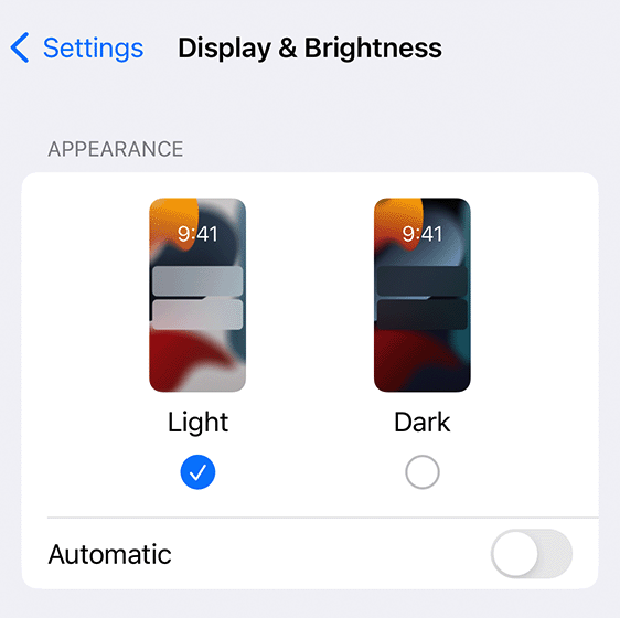
I'm using the user's color mode preference, set on their operating system, to determine whether to show the website in dark mode or not. For example, on an iPhone, the user can go to the iPhone settings to adjust their preference for dark mode.
To detect the user's color mode preference in browser code (TypeScript or JavaScript), use the following:
const colorScheme = window.matchMedia("(prefers-color-scheme:dark)").matches
  ? "dark"
  : "light";
Below, I've defined a method called getColorScheme that will return the current color scheme. I've also defined a method called registerColorSchemeListener which takes a function passed by the caller. It will listen for any changes to the user's preferred color scheme and call the function when changes occur. These two methods will be used by any component that needs to implement dark-mode support.
/** Possible color schemes used by both CSS and Remark42. */
export enum ColorScheme {
  Dark = "dark",
  Light = "light",
}

export function getColorScheme(): ColorScheme | undefined {
  return window.matchMedia("(prefers-color-scheme:dark)").matches
    ? ColorScheme.Dark
    : ColorScheme.Light;
}

/** Calls the listener on registration and on every color scheme change. */
export function registerColorSchemeListener(
  listener: (theme: ColorScheme) => void
) {
  listener(getColorScheme());
  const handleColorSchemeChange = (event: MediaQueryListEvent) => {
    listener(event.matches ? ColorScheme.Dark : ColorScheme.Light);
  };
  window
    .matchMedia("(prefers-color-scheme:dark)")
    .addEventListener("change", handleColorSchemeChange);
  return () => {
    window
      .matchMedia("(prefers-color-scheme:dark)")
      .removeEventListener("change", handleColorSchemeChange);
  };
}
Using dark-mode website colors
To update the basic colors on my website, my first step was installing a style system that supports dark mode. I'm using a style system so that I don't have to design my own colors. The style system contains colors in both dark and light versions. I decided to use Bootstrap because it's a popular and well-maintained style choice that I've been wanting to try out.
-
First you need to install Bootstrap. For my React application, I'm using React Bootstrap which I installed with the instructions from https://react-bootstrap.netlify.app/docs/getting-started/introduction. Note that v5.3 is the first Bootstrap version with color mode support.
-
In Bootstrap, you can set the color mode by setting the attribute
data-bs-themeon an HTML element. To set the color mode for the entire page, I set thedata-bs-themeon the body of the document. This code snippet shows how to update thedata-bs-themeattribute whenever the user's color mode preference changes. It uses theregisterColorSchememethod defined in the prior section: "Detecting the user's color mode preference".registerColorSchemeListener((theme: ColorScheme) => { document.body.dataset.bsTheme = theme; }); -
In order to change colors automatically with the theme, you must use Bootstrap color variables wherever you specify a color in your application. Here's an example of my SCSS using the variable
--bs-primary-color..headerItem { color: var(--bs-primary-color); }I used Bootstrap's _root.scss and _variables-dark.scss files to determine the color variable names.
Using dark-mode SVG's
On my website, I stored an SVG as a separate file and inserted it using an img tag. In order to support light and dark modes, I had to store a light version and a dark version for each SVG; the only difference between the two versions was the fill color. In my React component, I use the registerColorSchemeListener method to determine which SVG to insert into the HTML. (Note that this implementation is specific to SVG's that are inserted as files. Inlined SVG's can simply be styled with the desired color in CSS, using a Bootstrap color variable as described in the prior section: "Using dark-mode website colors".)
Here's an example of a home page component that has an SVG on it.
export default function Home() {
  const [githubIcon, setGithubIcon] = useState("");
  useEffect(() => {
    return registerColorSchemeListener((newColorScheme: ColorScheme) => {
      if (newColorScheme === ColorScheme.Dark) {
        setGithubIcon("/images/icons/brand-github-theme-dark.svg");
      } else {
        setGithubIcon("/images/icons/brand-github-theme-light.svg");
      }
    });
  }, []);

  return (
    <>
      // Other page content goes here // ...
      <a href="https://github.com/jessika">
        <img src={githubIcon} alt="Github icon" />
      </a>
    </>
  );
}
Using dark-mode third-party applications
My blog uses giscus for commenting. The following snippet shows how I configured Giscus to read the color theme.
export default function BlogPost() {
  const [colorScheme, setColorScheme] = useState(getColorScheme());
  useEffect(() => {
    return registerColorSchemeListener((newColorScheme) => {
      setColorScheme(newColorScheme);
    });
  }, []);
  return (
    <>
      // Blog content goes here // ...
      <Giscus
        // Other giscus parameters go here
        // ...
        theme={colorScheme}
      />
    </>
  );
}
Any other use case
The implementations for the different components (base website colors, SVG's, and giscus) were very similar. Many other use cases can be covered using the same pattern, using the methods defined in "Detecting the user's color mode preference" to register a listener and updating the component accordingly.